


While investigating the origins of ancient maps of Antarctica, the author discovers a copy of Agrippa’s long lost 2,000 year old Orbis Terrarum mysteriously affixed to the bottom of a 16th century globe and also determines Schöner’s method of choosing designs for his Antarctic continents.
Among all the maps produced at the turn of the 16th century portraying an Antarctic continent, there are probably none more remarkable than those produced by French mathematician and cartographer Oronce Finé. Finé’s maps not only present Antarctica as an independent landmass unlike maps such as the Piri Reis map, but also render the continent with amazing accuracy.
Finé’s 1534 World Map (Fig. 1) is rendered on a standard cordiform projection, a grid of latitudes and longitudes conforming to a singular heart-shaped frame. It is a colorful highly detailed map with Eurasia, Africa and the Americas highlighted in white while the Antarctic continent, splayed across a large portion of the map’s lower perimeter, is rendered gold. The gold toned continent is also distinguished from the rest with a Latin inscription spanning its width, “Terra Australis nuper inventa, sed nondum plene examinata,” translated “Southern land newly discovered, but not yet fully explored.” Had it been fully explored it would have been found to be a rather small landform which we know today as Tierra del Fuego. Twelve years prior to the creation of this map, Ferdinand Magellan discovered the strait allowing passage from the Atlantic to the Pacific and Finé was one of many attempting to predict the size and shape of the unexplored land forming the strait’s southern coast. Hence, the massive continent positioned just a few miles beyond the tip of South America to allow for Magellan’s strait.
While Finé 1534 map renders a fairly accurate shape for Antarctica, it is not so easy to discern within the cordiform projection. His 1531 world map (Fig. 2) includes the same design rendered on a double-cordiform projection, which places the world onto two heart-shaped hemispheres, one depicting the northern the other the southern hemisphere. The result being that the Antarctic design is presented with much less distortion, approaching the appearance of modern-day Antarctica presented on a standard polar projection. Considering the map’s remarkable resemblance to the actual Antarctic continent, one can easily understand Charles Hapgood’s reaction of awe and disbelief when he first stumbled upon it, Hapgood being the American academician who reintroduced the map to the world in 1966 with his book Maps of the Ancient Sea Kings. While our current view of history dictates that this cannot be an authentic map of Antarctica, the accuracy in Finé’s design strongly suggests otherwise.
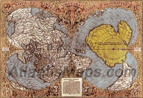
Figure 2 – Oronce Finé 1531 World Map. A double-cordiform projection providing a slightly different perspective on his Antarctic design. Considering the continent’s remarkable resemblance to Antarctica, one can easily understand Hapgood’s reaction of awe and disbelief upon first viewing it.
Evaluating these maps while focusing entirely on the volume and degree of accurate detailing they contain it would appear nearly impossible that these maps could be produced without the cartographers having referenced maps of the continent and yet there are enormously glaring inaccuracies which challenge their authenticity, the omission of the Palmer Peninsula being one. There is at least one possible explanation for this omission and that would be that these maps of Antarctica were territorial maps similar to maps of the United States with their omissions of Canada and Mexico. The only contradiction to this are the multiple river inlets along the northwestern coast of Western Antarctica suggesting that the area was bounded by a body of water whereas an overland border between Palmer and Western Antarctica would bear a solid delineation. This of course is assuming that the Palmer Peninsula was attached to the Antarctic continent. It is possible that, devoid of ice, the Palmer Peninsula would sit apart from Western Antarctica and find itself separated by a channel of water.
Yet even if this were so there are still the issues of the continent’s orientation and overscaling which demand an explanation. Finé’s Antarctic continent is rotated roughly 20 degrees counterclockwise from its actual alignment with South America, but much more troubling is the fact that Finé renders the continent 2-1/2 to 3 times its actual size. Hapgood attributes the error of overscaling to a copyist confusing the 80th parallel on the source map with the Antarctic Circle. It would seem that Hapgood spent little time investigating this particular theory. Had he done so he would have realized how flawed this idea actually was. If the copyist confused the 80th parallel with the Antarctic Circle—66.6° latitude—and the source map was inscribed with additional latitudinal delineations as Hapgood also suggests, this would mean that the source map had very little resemblance to Finé’s renderings of the continent and in turn have very little resemblance to Antarctica.
The error that Hapgood is postulating would have the copyist overscaling the continent’s interior by enlarging it 13-plus degrees latitude in all directions, but maintaining latitudinal scaling beyond the Antarctic Circle with the aid of latitudes marked on the source map. The result would actually be a major distortion or shortening of the continent’s perimetric features. This would be similar to an artist doubling or tripling the torso of a model, but maintaining the limbs at their normal size. In the case of both the cartographer and the artist, there is absolutely no possible way that they could overlook the fact that their resulting images in no way resembled the original subject. No, if we intend to validate these maps as ancient chartings of Antarctica, the overscaling and misalignment of the continent require a much more reasonable explanation.
In our quest to reconcile these distortions and establish these mysterious 16th century maps of Antarctica as valid maps having ancient origins, we will need to track this particular design back to its initiation into the cartographic archives. By analyzing the source we will attempt to determine the cartographer’s methodology and whether he was prone to dabbling in a little cartographic creativity or if he was more apt to rely upon ancient source maps in creating the Antarctic continent. The initial design appears to have been introduced by German mathematician and cartographer Johannes Schöner, appearing on his 1524 world globe (Fig. 3).
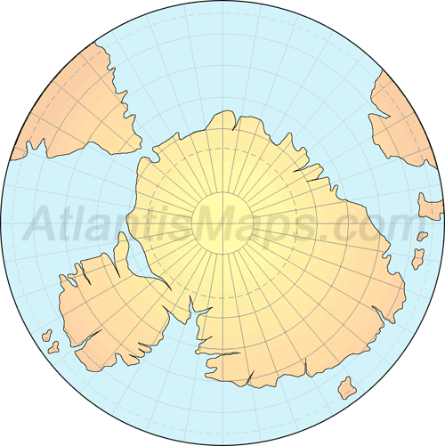
Figure 3 – Polar projection of an Antarctic continent based on Johannes Schöner’s 1524 globe.
The 16th century was a period of heightened world exploration driven by the thriving spice trade and a major discovery by Christopher Columbus in the latter part of the 15th century. In 1492 Columbus had set forth in search of a shorter route to the spice-rich East Indies by sailing west from Europe. Unfortunately he fell short of this goal when he encountered a rather large obstacle that would eventually come to be known as America, but the voyage and its surprising find captured the attention of Europeans intrigued by the adventurous tales of new discovery. From Columbus’ discovery on, many more expeditions set forth in search of the elusive western sea passage, and with the return of each expedition came word of new discoveries.
The fevered pace of exploration and discovery also drove a strong demand for charts and globes which presented the most recent, up-to-date portrayals of the world. It is with this backdrop that we find cartographers such as Johannes Schöner producing artistically rendered model globes depicting the latest geographical finds and it is here that we begin our determination of Schöner’s methodology in creating his Antarctic continent.
Schöner’s Methodology For
Cartographic Incorporation Of New Discoveries
In October of the year 1520 Ferdinand Magellan sailed into the annals of history when he entered the mouth of the strait that now bears his name. The strait, which separates the tip of the South American mainland from the small archipelago of Tierra del Fuego, allowed European trade ships direct passage from the Atlantic to the Pacific, home of the Spice Islands. And so it was that shortly after reports of the epic discovery made their way back to Europe, Johannes Schöner incorporated the famous strait into his globe of 1524. What of course is not so clear, and what we will attempt to determine, is why it would lead Schöner and others to misrepresent the strait’s southern coast as a section of an absurdly large continent.
Partial blame can be placed on an incomplete report on the area of discovery. News of Magellan’s discovery provided detailed information pertaining to the strait itself, but without navigation further southward there had been no full determination of the actual size of Tierra del Fuego and therefore interpretation was left to the cartographers’ individual discretion. Unfortunately, Schöner’s 1524 World Globe initially offers little insight into the reasoning involved in opting for the continent-sized landform as a representation of Tierra del Fuego. We are extremely fortunate, however, that Schöner provides us the initial key to unlocking this mystery in the form of an earlier globe in which he incorporates his first depiction of the Antarctic continent in a most unique and unusual form.
Schöner took his first stab at depicting the Antarctic continent on a globe he fashioned in 1515. Antarctica as depicted on his world globe of 1515 (Fig. 4) shares very little in common with its 1524 counterpart. About the only similarity we can see is that it is an oversized rendering of the continent and is offset from the tip of South America creating a narrow passage similar to the Strait of Magellan. The inclusion of this strait has lead some to mistakenly suppose that the strait had been discovered prior to Magellan’s 1520 voyage, but this misconception is easily exposed under closer examination. The whole of Schöner’s 1515 strait lies between 38 and 47 degrees latitude south whereas the Strait of Magellan lies below the 52nd parallel, placing Schöner’s strait over 350 miles north of the actual Strait of Magellan.
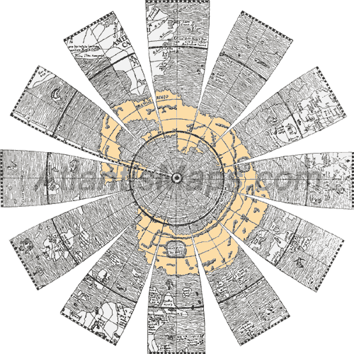
Figure 4 – Johannes Schöner’s 1515 globe gores of the southern hemisphere, which carry an extremely peculiar and vastly oversized rendering of the Antarctic continent.
The reason for this misguided placement appears linked to both a pervasively optimistic belief that such a passage would be found and a misleading report that appeared in a German tract printed circa 1508 in Augsburg, the Copia der Newen Zeitung auss Presillg Landt (New Tidings out of the Land of Brazil):
“Learn also that on the twelfth day of the month of October, a ship from Brazil has come here, owing to its being short of provisions. The vessel had been equipped by Nono and Christopher de Haro, in partnership with others.
Two of those ships were intended to explore and describe the country of Brazil, with the permission of the King of Portugal. In fact, they have given a description of an extent of coasts, from six to seven hundred leagues [1800 to 2100 miles], concerning which nothing was known before.
They reached the Cape of Good Hope, which is a point extending into the ocean, very similar to, Nort Assril, and one degree still further. When they had attained the altitude of the fortieth degree, they found Brazil had a point extending into the sea. They have sailed around that point, and ascertained that the country lay, as in the south of Europe, entirely from east to west. It is as if one crossed the Strait of Gibraltar to go east in ranging the coast of Barbary.
After they had navigated for nearly sixty leagues [180 miles] to round the Cape, they again sighted the continent on the other side, and steered towards the northwest. But a storm prevented them from making any headway. Driven away by the Tramontane, or north wind, they retraced their course, and returned to the country of Brazil.”
The tract relates the account of a Portuguese sponsored expedition, which explored over 1800 miles of previously unexplored Brazilian coastline—Brazil being the name then applied to the whole of South America. We can deduce from the numbers provided that the exploration of new coastline began some 1,620 to 1,920 miles north of the 40th parallel, somewhere in the range of Sao Paulo and Rio de Janeiro, Brazil. The continuation of the sailors’ route is plotted out onto both Schöner’s 1515 interpretation of the South American continent as well as a modern map of South America in Figure 5. Schöner’s 16th century rendering of the South American coastline approximates the modern rendering as well as would be expected from a map of the time, but as soon as we pass beyond the 40th parallel we begin to see where Schöner’s interpretation strays radically.
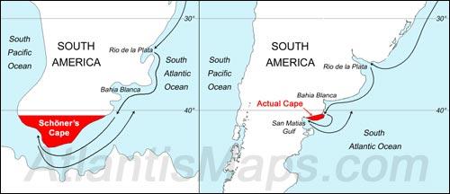
Figure 5 – The route taken by Portuguese sponsored sailors laid out
on Schöner’s 1515 version of South America (left) reflecting Schöner’s interpretation of the cape that extended into the sea beyond the 40th parallel. And the same route laid out on a modern map of the continent (right) which clearly shows that the point extending beyond the 40th parallel was merely the northern shore of the San Matias Gulf.
Schöner relies wholly on the account provided by the sailors who, undoubtedly elated over the possibility of having discovered the prized passage to the Pacific, relate an overly optimistic description of the region. They had actually discovered the San Matias Gulf as this complies with the sailors’ account of rounding a point of land 180 miles beyond the 40th parallel. That point appears to be the San Matias Gulf’s convex northern shore. If we trace a course along the coastline from the 40th parallel, the shoreline begins to rise at around the 160-mile mark. At 180 the sailors noticed this continuing rise and believed they were heading up the western coast of the continent. Had they been able to sail another 40 miles they would have viewed the closed western end of the bay, but they were deterred by a northwest wind which blew them down and out of the gulf. A wind out of the northwest would have directed them toward the gulf’s southern shore and past the Valdez Peninsula. After spying this southern coast they began to piece together the extent of their find.
While all that was truly witnessed was a waterway of undetermined depth flanked by shorelines to the north and south, it did not prevent the sailors from embellishing with some of their own presuppositions. And though not directly stating that the inlet was a through passage they do make a strong intimation by equating their brief encounter with the bay as mirroring passage through the Strait of Gibraltar into the Mediterranean Sea. To whet the reader’s imagination a bit more they add that this new inlet was similar to traveling eastward through the Strait of Gibraltar “to go east in ranging the coast of Barbary”, the vast North African coast, generating strong implications of an extensive coastline composing the strait’s southern shore although only a few scant miles of coastline were actually spied.
Equipped with the misleading account, Schöner was ready to begin the process of incorporating the new discovery onto his globe. He was left visualizing a South American continent that tapered to a point just beyond the 40th parallel, hovering just above the coastline of a land of indeterminable size creating a strait between the Atlantic and the Pacific oceans. Incorporating this newfound strait onto his 1515 globe may not have been too great a task in itself, but based on so little detail, how would Schöner determine to depict the land south of the strait? This leads us to Step 1 in Schöner’s methodology:
Schöner’s Methodology
Step 1: Referencing Ancient Source Maps
The first step to establish in Schöner’s process is the most crucial as it sets out to validate both Schöner’s 1515 and 1524 Antarctic continents as designs based on ancient source maps rather than randomly contrived designs. Yet upon first glance at his 1515 globe, it definitely appears that Schöner did not do anyone any favors by choosing a particularly unconventional design for his Antarctic continent, a design that looks every bit the part of an object lesson in creative design.
Schöner renders the Antarctic continent as a large irregular C-shaped landmass that looks a bit out of place on his globe when compared to the other continents and their more realistic geographical forms. The only real-world landmass that even comes close in appearance is an atoll, but an atoll approaching this size does not exist. The largest existing atoll is the great Chagos Bank and Schöner’s continent dwarfs it a thousandfold. Yet it is within the realm of feasibility that Schöner may have misinterpreted and scaled a map of an actual atoll onto his globe, which would at the very least support the theory that he was referencing earlier existing source maps for his inspiration.
It does not take long in the process of screening hundreds of atolls in a world atlas before it becomes wholly apparent that while a few atolls approach the C-shape of Schöner’s continent, there are none that would be near enough in overall likeness to build a compelling case. Throughout the screening process, there is one unique feature on Schöner’s design that prohibits locating a match, a set of two prominent peninsulas located just clockwise of the opening in Schöner’s C-shaped continent and extending into the interior body of water. However these two peninsulas, which prove to be impediments in attempting to associate the southern landmass with an existing atoll, become a bit more accommodating as we readjust our sights from two peninsulas extending into a small lagoon to two much, much larger peninsulas extending into a very sizable sea.
That the significance of these two peninsulas is initially overlooked is no doubt due in part to the unexpected and bizarre nature of Schöner’s feat, and to be fair to Schöner there is a substantial amount of distortion in the overall design which certainly contributed to Schöner’s failure to realize the grand error he was making. Yet as we shall see this will prove a most fortunate mistake in our favor as we now have solid undeniable proof that Schöner had indeed referenced and copied an ancient source map in designing his Antarctic continent. It turns out that the two peninsulas actually represent two extremely well known, highly recognizable geographical features existing in the Mediterranean Sea: the lone set of prominent Peninsulas, Italy and Greece. As we will shortly establish in full, Schöner had unwittingly affixed an entire ancient world map onto the bottom of his world globe.
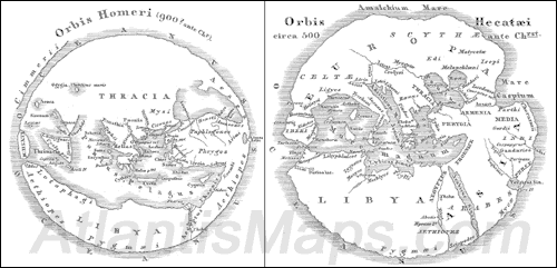
Figure 6 – Reconstructions of Homer’s (left) and Hecataeus’ (right) world maps.
The overall design of this particular world map shares its pedigree with maps from Ancient Greece. Ancient Greek maps such as those of Hecataeus and Homer (Fig. 6) depicted the world as a circular disk portraying Europe, Asia and Africa united in a singular circular band of land wrapped around a large inner sea, the Mediterranean. In turn the whole of the world is surrounded all about by an outer ocean. The Strait of Gibraltar is located at the western end of the Mediterranean Sea forming the only passage between the inner sea and outer ocean. The combination of the Mediterranean Sea and Strait of Gibraltar effectively separate Europe from Africa to create a simple world map in the form of a reversed ‘C’.
To better visualize the similarities between the ancient Greek maps and Schöner’s map, Figure 7 omits the extra detailing of inland bodies of water on the Hecataeus map and it along with Schöner’s map have been broken down into their three basic components: 1) The upper arm, Europe, 2) The lower arm, Africa, and 3) The peninsulas, Italy and Greece.
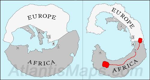
Figure 7 – Break down of Hecataeus (left) and Schöner’s (right) world maps into 3 basic components: Europe, Africa and the dual peninsulas of 1) Italy and 2) Greece extending from Europe into the Mediterranean Sea. Other shared elements: 3) A small peninsula and gulf along the western coast of Turkey representing the site of the ancient port city of Smyrna, 4) The southern coast of Turkey cantilevered out over Africa, 5) The curved transition from Egypt to Syria, 6) the elevated coastline of Western Africa, and lastly the similar arrangement and proportions shared overall.
The point where the southern coast of Turkey veers perpendicularly into the Mediterranean effectively splits each map into two similarly sized halves: Europe composing the northern half and Africa the southern half. In evaluating Africa we notice that both maps round out the normally squared corner between Israel and Egypt creating a continuous sweeping coastline from Syria to Egypt. Following this coastline from Syria westward, the last third exhibits a significant rise providing a reasonable portrayal of the stepped nature of the North African coast. On a modern map, the northern coasts of Egypt and Libya remain on a level that never rises beyond the 33rd parallel, but toward the west the coastline rises up into the Mediterranean at Tunisia leveling off around the 36th parallel with the combined northern coasts of Tunisia, Algeria and Morocco. Schöner’s rendering may be lacking in some details, but allowing for the overall primitive nature of this world map the similarities shared with the North African coastline prove fairly accurate.
Turning our attention to the upper arm with the Italian and Greek peninsulas sheared away, the only discernable similarity in the rendering of the European continent is their arc. Schöner’s map even deviates from that a bit by distorting the Iberian Peninsula, redirecting Spain and Portugal inward at a right angle into the Mediterranean Sea. This in no way disqualifies this as an ancient world map as there are major distortions and variances in all ancient maps. Schöner does appear to have had access to a far better variation which he passes on to us in his subsequent globe of 1520. The facsimile of that globe (Fig. 8) portrays the western hemisphere with a coastline protruding along the lower left which matches Schöner’s 1515 depiction of the Western African coastline suggesting that Schöner was referencing a very closely related C-shaped world map. The portion of land protruding from the lower right side of the facsimile depicts a more accurate and improved version of the Iberian Peninsula.
Figure 8 – Facsimile of Schöner’s 1520 globe, which shares the same West African coastline (lower left) as his 1515 globe, but offers a much more accurate representation of the country of Spain.
Comparing this portion of land with the actual Iberian Peninsula (Fig. 9) the similarities are quite apparent. In both depictions the peninsula appears as though it were nearly pinched off at the border with France. This ‘pinch’ is composed of a smoother coastline along the interior Mediterranean Sea and a deeply notched, squarish coastline on the outer Atlantic side forming the Bay of Biscay. Even more telling is the large distinctive point of land at the extreme end of the peninsula corresponding to the southwestern most tip of Portugal where the town of Sagres is located. The 1515 map appears to have a narrower needlelike depiction of this point extending into the Mediterranean Sea, but the 1520 version is much more accurate and correctly depicts the point as straddled by two smaller points. The point lying more toward the outer Atlantic being the location of Lisbon, Portugal, and the point lying on the Mediterranean side being the location of Gibraltar. The 1520 globe not only mimics these features very well, but also accurately depicts the point corresponding to Gibraltar as lying directly across from the nearest point in Africa approximating the constrictive nature of the Strait of Gibraltar.
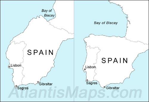
Figure 9 – Spain as depicted on Schöner’s 1520 Antarctic map with borders added for comparative purposes (left) alongside Modern day Spain (right). The key similarities lie in the accurate portrayal of the Bay of Biscay, and in the three points of land where Lisbon, Sagres, and Gibraltar are located.
Returning to Schöner’s 1515 globe and the pair of peninsulas, the map accurately portrays the two lone adjacent peninsulas as isolated along the northern coast of the Mediterranean with the thin rectangular peninsula directly to the west of a shorter stubbier peninsula providing a fairly compelling representation of the Italian and Greek peninsulas. The depiction of the Italian peninsula even details two opposing promontories extending off its farthest extremity fashioning a rather primitive version of the toe and heel of the signature ‘Boot of Italy’ (Fig. 10).
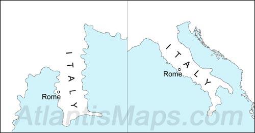
Figure 10 – Italy as depicted on Schöner’s 1515 Antarctic map (left) alongside modern-day Italy. Like modern-day Italy, Schöner depicts the continent as a narrow rectangular shaped peninsula with two promontories extending off the bottom two corners.
The Greek peninsula is rendered in a rather primitive fashion as well, yet is detailed sufficiently so as to define a key area of the country: the location of Athens. Athens is located midway down a narrow strip of land extending eastward off of the main trunk (Fig. 11). Alongside the site of Athens is a small narrow nub of land jutting back toward the west. On Schöner’s map this small feature terminates abruptly where it normally forms the Corinthian Isthmus that connects to the rather large Peloponnesus Peninsula. This omission could be attributed to many factors, among them the poor condition of the source map or simply an oversight by an ancient cartographer or copyist.
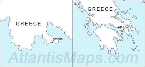
Figure 11 – Greece as depicted on Schöner’s 1515 Antarctic map (left) alongside modern day Greece. Schöner’s map lacks detail similar to most ancient maps, but demonstrates the importance of Athens by accurately rendering the area surrounding the Greek capital.
The final recognizable detail pertains to Turkey (Fig. 12) where it is first worth noting that the southern coastline, although a bit condensed, exhibits an undulating shoreline very similar to its modern day coastline. While this feature alone may not be overly convincing in validating this as a portrayal of Turkey, taken in tandem with the detailing of a small hook-shaped peninsula extending off the western coast, the combined features should prove sufficient. The hook-shaped peninsula is a rather accurate rendition of the peninsula that bounds the Gulf of Izmir. Not only is the peninsula correctly located east of the representation of Greece, but it is also accurately aligned with its point paralleling the coast in a counterclockwise direction. The gulf itself accurately conforms to the actual gulf’s 40-mile deep by 20-mile wide proportions and even appears to add the little bump of land that projects out from the lower end of the gulf. The fact that this gulf is one of the more accurately defined features of the map reflects the importance of the ancient city of Smyrna, a city once located inside the gulf that existed as a prominent city port under both Greek and Roman rule.
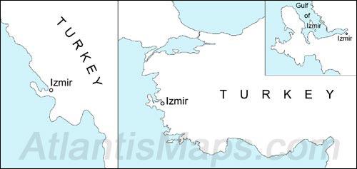
Figure 12 – Turkey as depicted on Schöner’s 1515 Antarctic map (left) alongside modern day Turkey. Schöner’s map compresses the country’s undulating southern coast, but provides a surprisingly accurate portrayal of the Gulf of Izmir (inset), even including the small cape projecting from the southern shore. The gulf would have been an important feature to include as it was once the location of Smyrna, a prominent city port under both Greek and Roman rule.
So who do we credit with authoring Schöner’s source map? The Greeks? The overall design of the map negates this possibility. The Greeks maintained a Greco-centric view of the world so when they went about constructing their simple circular world maps, it was the customary practice to locate Greece in the geographical center of the world. (Reference the Hecataeus and Homer maps, Fig. 5) Schöner’s map clearly does not conform to this rule of design, which would rule out Greek origin.
The first key to determining the source map’s origins can be found in a feature stretching across the width of Schöner’s Africa in the form of the map’s lone inland waterway, an unusual water feature appearing as a long thin undulating channel terminated at both ends by large mountain lakes. This feature may seem out of place as there are no such water features even remotely similar existing in Africa, but as it turns out this design follows very closely ancient Rome’s concept of one of the most historically renowned rivers in the world, the Nile.
Figure 13 is a reconstruction of one of Rome’s most famous world maps, Agrippa’s Orbis Terrarum, which was a large display map completed around 20 A.D. Copies of the map were distributed throughout the ancient empire and continued to be in existence in medieval Europe where they were referenced when designing the mappae mundi, medieval maps of the world. Copies of the Roman original eventually disappeared, therefore, reconstructions like the one shown here base their design upon a combination of geographical information gleaned from ancient historians as well as the medieval mappae mundi derived from the Roman original.
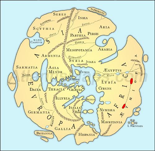
Figure 13 – A modern reconstruction of Agrippa’s Orbis Terrarum, which like Schöner’s map depicts a lateral landlocked waterway in Africa that is terminated at each end by large lakes (highlighted in red).
One of the more noticeable aspects of this reconstruction is its orientation, which borrows from the Medieval practice of aligning east towards the top of the map, a cartographic practice for which the word ‘orient’ acquired the definition ‘to align’. The feature we will want to focus on, however, is the small laterally arcing waterway positioned in the middle of Africa. It is not nearly as imposing as Schöner’s lengthy waterway and exhibits a tighter smoother undulation, but like Schöner’s version not only does it set itself apart as the only waterway that is completely landlocked, but it is also the only waterway terminated at both ends with large lakes. All other depicted rivers empty into seas or the outer ocean. And like Schöner’s map this unusual waterway effectively divides the continent of Africa into two regions, north and south. As we shall see, if there were any doubts regarding the map’s authenticity this feature should fully dispel those doubts.
This water feature actually maintains ancient Rome’s basic misconception that the source of the Nile originated in a West African mountain lake and flowed eastward across the continent. Pliny the Elder, a first century Roman historian writes the following with regards to the Nile in the historical work, Natural History:
“It rises… in a mountain of Lower Mauritania, not far from the ocean; immediately after which it forms a lake of standing water, which bears the name of Nilides… Pouring forth from this lake, the river disdains to flow through arid and sandy deserts, and for a distance of several days’ journey conceals itself; after which it bursts forth at another lake of greater magnitude in the country of the Massaesyli, a people of Mauritania Caesariensis.
It then buries itself once again in the sands of the desert, and remains concealed for a distance of twenty days’ journey, till it has reached the confines of Aethiopia. Here… it again emerges… forming the boundary-line between Africa and Aethiopia.” – NH, Book V, chapter 10.
Pliny’s account varies a bit from the river’s layout on the reconstruction, but essentially shares the concept of a source lake in Mauritania, located in western Africa, that feeds an eastward flowing Nile River. This waterway extends across the continent to form a boundary between Africa to the north and Ethiopia to the south. In eastern Africa this misconceived Upper Nile ceases its aboveground progress and supposedly empties into an underground river where it continues to flow until it rises one last time as the Lower Nile River, flowing unabated above ground and eventually emptying into the Mediterranean Sea.
Compared to Schöner’s depiction of the waterway, the reconstruction above opts for a more conservative portrayal, perhaps in an attempt to credit the Romans with a little higher cartographic aptitude, but in referencing maps that are direct derivatives of Agrippa’s map it seems that Schöner’s map may indeed be the more accurate depiction. One such map is the Hereford Mappa Mundi (Fig. 14).
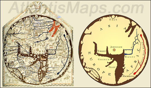
Figure 14 – The Hereford Mappa Mundi (left), perhaps the most renowned of the mappae mundi, alongside a stripped down reproduction. Like the reconstruction of Agrippa’s map it incorporates the mysterious landlocked waterway spanning the width of Africa (highlighted in red on the right-side image). Also of note is the lateral mountain range paralleling the waterway to the north. Signature features distinguishing the map from Roman and Greek maps are the city of Jerusalem positioned at the map’s center and the Garden of Eden rendered as a circular island in the east.
The Hereford map is preserved in England’s Hereford Cathedral and is a medieval map whose origin dates back to circa 1290 A.D. Like Agrippa’s map it is a rather large map intended for public display, measuring approximately 62” tall by 52” wide with the inclusion of its decorative pentagonal border. The map itself is a circular rendering similar to ancient Greek design, but employs the cartographic practice of orienting east toward its top. European cartography does add its own unique stamp on the circular map design with elements reflecting a Medieval Europe that had transitioned into a Christian society. Taking its cue from Greek map design and its concept of cartographic centricity, the Hereford and other mappae mundi adopted a Christocentric design, locating the holy city of Jerusalem at the map’s center. This radical design decision countered the practice of Greco-centricity with the preferred adherence to a literal translation of Ezekiel 5:5, “This is what the Sovereign LORD says: This is Jerusalem, which I have set in the center of the nations, with countries all around her.”
Along with the requisite place names, the map is littered with inscriptions of varying lengths providing detailed information particular to the regions in which they are inscribed and while the majority of these inscriptions appear sourced from pagan authors exposing the map’s Roman influence, at least twenty inscriptions are included on the map that further reflect Europe’s Christian influence. This influence extends to the map’s inclusion of a representation of the Garden of Eden at the top of the map as well as an image of Jesus being attended to by angels that adorns the upper portion of the map’s pentagonal border. The map also exaggerates the size of Palestine allowing space for further Christian detailing such as an image of the walled city of Jerusalem with Christ’s crucifixion drawn just above it.
The faded and discolored appearance of the map belies its original beauty. The original detailing was certainly very stunning with the surrounding ocean and seas colored green, red coloring applied to the Red Sea and Persian Gulf and the numerous inland lakes and waterways scattered about the map are differentiated with a deep blue coloring. And most importantly we find one of these blue colored waterways cutting a wide arc across the continent of Africa, which, like Schöner’s map, is terminated at both ends by large lakes. Like the reconstruction of Agrippa’s map, this rendering of an Upper Nile is conspicuous in that it is the only body of water configured in this manner, yet the Hereford map’s rendering is much more imposing, mirroring the same grand presence as depicted on Schöner’s map. Also mirroring Schöner’s map is a mountain range paralleling the waterway on its northern side with the slight difference of Schöner’s mountain range rendered as one continuous length that extends well beyond the water feature in the east while the Hereford mountain range is composed of two lengths with its eastern extremity terminating near the eastern end of the waterway.
Providing a link between the Hereford and Schöner maps is another globe constructed around the same time as Schöner’s 1515 globe: the Green Globe. The Green Globe (Fig. 15), also known as the Quirini globe, bases its rendering of the southern continent on the same conceptual design as Schöner’s. Of note is that its rendering of the lateral waterway maintains a tighter undulation and is a near arc that matches more closely the Hereford version.
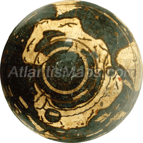
Figure 15 – The Green Globe, which derives its name from the deep green coloring of its seas, depicts an Antarctic continent similar to Schöner’s 1515 depiction, but renders the African water feature as an arc with slight undulations which more closely matches the Hereford’s rendering.
So it would seem that the original Roman portrayal of a mythical Upper Nile could very likely have been a prominent feature similar to the portrayal on Schöner’s map and the Hereford Mappa Mundi. This is a very common portrayal of the feature that is carried by a few other notable mappae mundi: The 10th century Cottonian, 11th century Isidorean, 12th century Henry of Mainz and Liber Floridus, and the 13th century Ebstorf map just to name a few. Sometimes these maps portray the waterway as terminated by lakes at both ends and sometimes at only the western end, but in all these maps, just like Schöner’s, the unique waterway always stretches across the width of Africa and terminates inland never emptying into the outer ocean or inner sea. Schöner’s lack of a lower Nile may be a bit disconcerting, but the 14th century Higden Mappa Mundi (Fig. 16) demonstrates that it was not alone in displaying the mythical Upper Nile while omitting a clear representation of the true Nile itself.
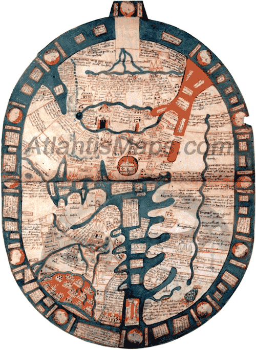
Figure 16 – The Higden Mappa Mundi, which also prominently features the African waterway, like Schöner’s map does not have a clear representation of the actual Nile.
While the Hereford and other mappae mundi provide proof of Schöner’s map being a true world map, it is the map’s similarity to copies of ancient Roman maps which seals its Roman heritage while providing insights into key aspects of Roman cartography. The first map is a world map from the 1482 Ulm edition of Claudius Ptolemy’s The Geographia. Ptolemy was a Greek mathematician, astronomer and geographer living under Roman rule in Egypt during the 2nd century A.D. who established many of the principal concepts for modern cartography. In his treatise, The Geographia, Ptolemy defines the geography of the Roman Empire and is believed by many to have included a world map, one similar to the one included in the 15th century Ulm edition. (Portion depicted in figure 17) Being that Ptolemy employs a modified spherical projection, the map varies significantly in appearance to Schöner’s less technical design, yet there is a key characteristic clearly shared between both maps. Like Schöner’s map, Ptolemy’s includes a vast mountain range spanning the full width of the African continent, dividing the continent into an extremely slim northern region and a very deep and vast southern region.
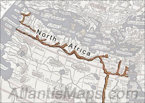
Figure 17 – Section of Ptolemy’s World Map found within a 15th century edition of Claudius Ptolemy’s The Geographia with mountains on the African continent highlighted. Note how the length of mountains range the full width of North Africa. Schöner’s map similarly strings a mountain range just inside the coast of North Africa, extending it the width of the continent as well.
That this is a common Roman design concept can be established with the second Roman map offered for our review, the Tabula Peutingeriana (Fig. 18a and 18b). The Tabula Peutingeriana, or Peutinger Table, is a replica of a first century Roman itinerarium, essentially a roadmap of the Roman Empire that is believed to have been referenced in the making of Agrippa’s Orbis Terrarum. This particular copy was discovered in 1494 in a library in Worms, Germany and derives its name from Konrad Peutinger who eventually acquired the map in 1508. The Peutinger Table is composed of Europe, Asia and North Africa—omitting the southern portion of the African continent—and portrays North Africa similarly to Ptolemy and Schöner’s maps with a lateral mountain range defining its southern border.
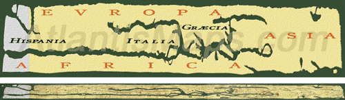
Figure 18a – Two representations of the Tabula Peutingeriana: A reconstruction that is stretched vertically (top) providing a better perspective on the layout of continents and an actual image (bottom) of the 13.5 inch by 22 foot map scaled to fit the page.
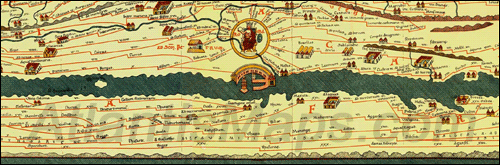
Figure 18b – An enlarged section of the Peutinger Table centered on the city of Rome illustrating the extensive detailing including mountains, waterways and a vast network of roads inscribed with distances between various cities and outposts. Like Ptolemy and Schöner’s maps, North Africa is rendered with a mountain range delineating its southern border. Note that the Peutinger Table omits Africa’s vast southern region which lies beneath this range.
Another significant aspect of the Peutinger Table is the deliberate distortion plied to the map. The table constricts and flattens both the Mediterranean Sea and the continents and folds the Italian Peninsula in on its side so that it is pointing eastward toward a stubbed Greek Peninsula. The purpose of these and other geographical distortions are clear: To constrain the entire table within the confines of a transportable form being only 13-1/2 inches in height with 22 feet of scrollable length. The distortion of the Mediterranean Sea would have been of little concern since the table was not intended for naval navigation. Equipped with numerous roads drawn throughout along with inscribed measurements revealing the distance of travel between key areas of the Roman Empire, the map was clearly intended for use by overland travelers.
Like the Peutinger Table, Schöner’s map deliberately distorts both the Italian peninsula and the Mediterranean Sea to effect a particular design scheme on the over all map. Schöner’s map folds the Italian Peninsula on its side away from the Greek Peninsula, while also enlarging the Mediterranean. This attains the final result of a large imposing circular version of the Mediterranean Sea delineated by Italy’s altered eastern coast, Turkey’s western coast and the elevated northwestern coast of Africa (Fig. 19).
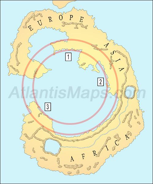
Figure 19 – Schöner’s map with rings superimposed demonstrating the concentric design of the Mediterranean Sea. Defining the innermost ring is 1) the eastern coast of Italy, 2) the western coast of Turkey, and 3) the elevated northwestern coast of Africa.
While the Peutinger Table was distorted to facilitate ease of portability, Agrippa’s map was a large map intended for public display similar to the Hereford Mappa Mundi. So how would Schöner’s design with its distortion of the Mediterranean find itself suited to this capacity? We need to keep in mind that the creation of the map was intended to record and display Agrippa’s extensive and meticulous survey of the known world, as Pliny confirms, “Agrippa, a man of such extraordinary diligence, and one who bestowed so much care on his subject, when he proposed to place before the eyes of the world a survey of that world.” (NH 3.3) This leaves us with a bit of a conundrum as to why Agrippa would feature the Mediterranean Sea so prominently when the true focus of the map was a land survey. Assuming that Schöner’s design is a true representation of Agrippa’s world map we should expect that the purposely rounded and oversized sea would not be relegated to simply portraying a vast watery void, but would be more apt to incorporate content which augmented the map and Agrippa’s land survey. The most practical content to serve this purpose would likely be a consolidation of notes or commentary, a concept that is not completely without basis.
In fact it is widely believed that Agrippa had provided some form of commentary with his map. This is based in part on several passages in Pliny’s ‘Natural History’ referring to statements by Agrippa that pertained to his survey. These statements relate to geographical information normally not conveyed through a map alone. For example, according to Pliny, Agrippa wrote regarding the inhabitants of one region, “M. Agrippa supposed that all this coast was peopled by colonists of Punic origin,” (NH 3.3) and also described some geographical regions as being inaccessible, “Agrippa states that the whole of this coast, inaccessible from rocks of an immense height, is four hundred and twenty-five miles in length, beginning from the river Casius.” -NH 6.15
Some historians have gone so far as to suggest that there never was a map, but only a commentary, while most believe the map did exist, but the commentary existed apart from it. Schöner’s design offers a third option: that all or part of Agrippa’s commentary had been incorporated into the map, specifically, within the map’s circular interior.
The mappae mundi borrowed their pagan commentary from a Roman source and it is highly likely that source was Agrippa’s map. The migration from a centrally located commentary suggested by Schöner’s circular interior to the mappa mundi’s inland distributive commentary would be a very logical progression when placed in the context of the period. Again it relates directly to Christocentricity and the desire by medieval cartographers to place the Christian holy city of Jerusalem at the map’s center. In order to effect this change, it required cartographers to expand Asia inward toward the map’s center. If we consider a design similar to Schöner’s as being the source map with a centrally located commentary, the enlargement of Asia would have displaced roughly half of the inner circle along with half the map’s commentary. To retain the commentary and maintain Jerusalem at the map’s center the medieval cartographers had little option but to transfer the displaced commentary onto the enlarged Asian continent. In turn, maintaining consistency of design throughout the map would have further dictated the expansion of the European and African continents into the remaining half of the inner circle and similar redistribution of commentary over these enlarged continents.
Interestingly the Psalter Mappa Mundi (Fig. 20), a late 13th century map, demonstrates the feasibility of Schöner’s design and at least one way to benefit from a consolidated commentary. The Psalter map measures a mere 3 1/4 inches in diameter allowing it to fit in a small book of Psalms from which it derives its name. It is similar to other mappae mundi in design, but because of its small size is limited to a small fraction of the place names and completely devoid of the commentary normally distributed about larger mappae mundi. As a work around, a separate reduced commentary is located on the reverse side of the page, where it is inscribed within a circular frame, providing a rough glimpse at the way in which Agrippa’s inner circle of text may have once appeared while also demonstrating the logical separation of standard cartographic elements from supplemental commentary. The commentary’s circular frame is actually a tripartite map, a medieval concoction that is also termed a T-O map because of the way it represents the world as a simple circle divided into three parts by a ‘T’. The three resultant divisions represent the continents of Europe, Asia and Africa. The Psalter map fills these three continental frames with commentary apportioned accordingly. Hence, on the fore map we find the now familiar Upper Nile spanning the African continent with depictions of odd mutated humanoids lining its southern shore, while within the African section of the tripartite map we find associated commentary referencing these ‘Ethiopian monsters’.
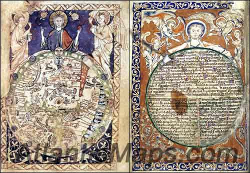
Figure 20 – The Psalter Map incorporated into a small book of Psalm with the map on the fore page (left) and commentary consolidated on the back (right), splitting the standard mappa mundi design into two logical and practical components.
The Psalter dual part map not only proves a very logical and efficient means to preserve both the design of the complex mappa mundi along with the commentary in a small form factor, but it also provides an intuitive device for referencing commentary without the need to scour about the main map. Such a device becomes magnitudes more practical when applied to a very large map. Assuming that Agrippa’s map as it was originally displayed on the Roman portico was much larger than the Hereford Mappa Mundi, it would have proven an extreme convenience to the viewer to access the map’s extensive commentary consolidated within the confines of the map’s circular rendering of the Mediterranean Sea.
At this point there is now no doubt that we have indeed discovered an ancient Roman world map at the bottom of Schöner’s 1515 world globe. All that remains is a reconstruction of the map to its original appearance. We will begin by attempting to establish the map’s original orientation. The map’s orientation has long been disputed among scholars with north, south and east all considered viable possibilities, but Schöner’s map appears to confirm a northern orientation much like the Roman Peutinger and Ptolemy maps. This can be deduced from the internal symmetrical geometric framework around which the map was built.
Artistic paintings often have the general detailing and layout sketched onto the canvas as guides before the paint is applied, so too was the case with ancient maps. While Ptolemaic maps benefited from a grid composed of latitude and longitude, we know that latitude and longitude were not implemented in ancient Roman maps like the Peutinger and Agrippa maps. Yet it appears that Agrippa’s map does incorporate a structural guide. The map uses simple geometry to divide the Mediterranean Sea into three significant zones around which the three continents are wrapped.
The geometric framework begins with a set of concentric circles or arcs. Figure 21 reveals four of these:
- The innermost circle formed by the coasts of eastern Italy, Turkey and Northwest Africa. This represents the largest section of the Mediterranean Sea, Zone 2, and as discussed earlier this was most likely used to accommodate Agrippa’s commentary.
- The next ring runs along the opposite, western shore of the Italian Peninsula as well as along a short peninsula extending off of Western Africa. (Note both peninsulas fit within the band created by circles A and B.)
- A third ring is defined by the combined coasts of north central Africa and the Middle East, and lastly
- A ring along which the mythical meandering Upper Nile is centered.
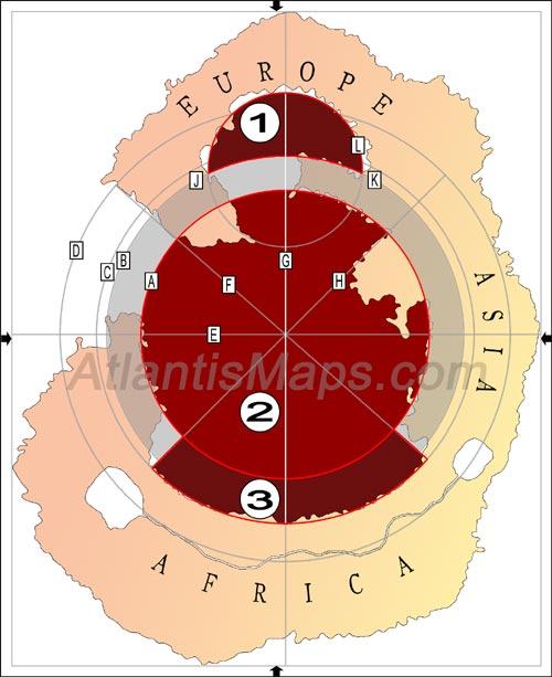
Figure 21 – Author’s reconstruction of the map’s original framework and orientation. In the process of creating the original map, a set of perpendicular lines, E and G, were drawn setting the four cardinal directions. Bisecting lines, F and H, established the western coasts of the Iberian and Greek peninsulas and the extent of the lower North African/Mideast coast. Concentric circles A thru D, centered on the map, established guides for interior coastlines and the positioning of the Upper Nile. Circle L centered on centerline G sets the coastline west of Italy. The final design divides the Mediterranean into 3 geometrically aligned zones, 1, 2 and 3.
These rings were not only guides for coastlines and waterways, but they also established a center point upon which was built the remaining framework. There are two lines that align with this center point in the form of two of the map’s straightest stretches of coastlines. These are the western coasts of the Iberian and Greek peninsulas, which also happen to be the only two significant intrusions into the map’s innermost circle, Zone 2. Figure 21 draws two lines (F and H) running along these coasts and through the common center point of the concentric circles. The intersection of these two lines creates angles that are 3.7° off from perpendicular. Agrippa’s original map may have ran these lines perpendicular to each other and the 3.7° discrepancy here as well as slight discrepancies elsewhere in the framework can be attributed to minor alterations incurred as the map was replicated without the benefit or awareness of the original guides.
Confirming that these lines were indeed part of the framework is the fact that these two lines intersect the lower North African coast which runs along circle C, roughly coinciding with the width of the African coast just before it rises at Mauritania in the west and Turkey in the east. This also establishes the second largest section of the Mediterranean Sea, Zone 3, which is an arcing band lying between Zone 2 and Africa’s northern coast.
The third significant portion in the design of the Mediterranean Sea, Zone 1, is located along Italy’s western coast. In Figure 19, circle B delineates the lower surface of this space, while the upper half of circle L defines the arched coastline opposite Italy’s western coast. Circle L has been created by drawing a circle through circle B’s intersection with the European coast (points J and K) with a center point set equidistant to those intersections on centerline G.
With this framework established, the linear nature of the map becomes clear, the map defines the Mediterranean Sea with three center-aligned geometric zones: Zones 1, 2, and 3. Utilizing the centerline running through the midpoints of these three zones, the map has been rotated so that the centerline runs vertically with the arched Zone 1 positioned toward the top. The reasoning behind this orientation is based on the shape of Zone 1. The zone is a semicircular shape mimicking the Roman arch, an architectural creation popularized by the Romans. Roman arches are oriented arching upward above structural openings, so it is fitting that the Romans purposely distorted the Iberian Peninsula in order to create this arched zone rising majestically above the city of Rome. The location suggests that this zone was set aside to honor Rome or one of its rulers, much like the Peutinger Table’s representation at Rome of an enthroned woman framed by a large inscribed circle (Fig. 18b).
One of the noticeable effects of this alignment, which further supports this as the original orientation, is how it places the inner circle, Zone 2, very near the map’s horizontal and vertical center. The four arrows along the map’s perimeter mark the map’s true horizontal and vertical centers demonstrating the slight variance between Zone 2’s center and the map’s actual center. The sense of the map’s original symmetry can also be seen in that the horizontal line drawn through the map’s center (E) bisects Asia at its outermost point with the coastline falling away on either side at a similar angle. Similarly, the vertical line drawn through the map’s center (G) bisects Europe in the north at its highest point with the coastline again falling away on either side at similar angles.
It may seem odd to refer to the alignment of the map as having a northern orientation while the Italian Peninsula is clearly lying on its side, but the map is actually discerned as having a northern alignment based on the positioning of the continents; Europe located above Africa and Asia off to the right. This also proves true of the Roman Peutinger map, which also places the peninsula on its side.
Figure 22 resurrects Agrippa’s Orbis Terrarum with a reconstruction based on Schöner’s map. The three major zones composing the oversized rendering of the Mediterranean Sea can be seen accommodating components that would later be redistributed about the mappae mundi. Zone 1 which is located at the top of the map, adjacent the city of Rome, is fitted with a banner inscribed with the name ‘Augustus’ while rising above it is a semicircular frame conforming to the arch of Zone 1. The arched frame houses an image of Caesar Augustus that along with the banner bestows honor and credit to the man responsible for the map’s existence. Mappae mundi like the Hereford and Psalter maps still retain this space, but relocate it above the map, replacing the Roman representation with an image of Jesus Christ.
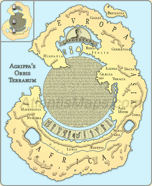
Figure 22 – Author’s reconstruction of Agrippa’s Map based on the map at the bottom of Schöner’s 1515 globe. The reconstruction reflects a northern orientation with Europe towards its top and Africa below and fills the three zones (see inset) with 1) A tribute to Caesar Augustus the man responsible for commissioning the survey that would lead to the map’s creation, 2) An extensive commentary which would have provided detailed information pertaining to the geography of the world that had been obtained through Agrippa’s survey, and 3) A grid displaying a variety of creatures and plants believed to inhabit the world.
Zone 2, the innermost circle, has been fitted with a lengthy commentary, which would later be broken up and distributed throughout the mappae mundi according to its corresponding region. Determining the actual amount of text included on the original map can only be roughly approximated by a number of unknown factors, among them the map’s overall size, text size, and line spacing. As a very rough example, if we scale the map to the Hereford’s 52-inch width and use standard rule spacing between lines of text, the total commentary fitting within this inner circle could exceed 2,000 words, or about 7 standard pages of text; a pretty reasonably sized commentary. If we apply the same ruled spacing, but grant equal importance to Agrippa’s map as was given the largest known mappa mundi, the Ebstorf, measuring nearly 12-feet in diameter, the commentary balloons to over 14,000 words, approaching 50 standard pages of text, which would allow for the inclusion of an astonishing wealth of geographical data.
Zone 3, the arcing band located between Turkey and Mauritania, had a usage that is actually fairly straightforward. This arced band did not completely disappear during the Christocentric transition, but found itself migrating directly southward below the mythical Upper Nile. This feature as found on the Hereford, Psalter, and many other mappae mundi, is segmented into multiple boxed frames containing images of mutant humanoids believed to have inhabited the lower regions of the African continent. These creatures are documented in Pliny’s Natural Histories and since Agrippa’s map was constructed within that time period and Roman mindset, it likely incorporated them into Zone 3. The medieval mappae mundi appear to have borrowed them directly from Agrippa’s map, even retaining the zone’s relationship to the Nile, being both parallel and constrained closely to the length of the waterway.
The reconstruction borrows back the chain of creatures located beneath the Hereford Map’s Upper Nile and returns it to its original location in Zone 3. The original arced chain was likely a grid composed of more columns, rows, or both, allowing it to accommodate representations of all the map’s flora and fauna. While many of the mappae mundi like the Hereford retained intact a sizable section of the original grid containing the Ethiopian denizens, the remaining flora and fauna were detached from the grid and dispersed throughout Europe, Asia and North Africa according to its native region. Due to Agrippa’s centralized design, each creature would have had to have been accompanied not only by an inscription providing the specific name and description as is done on the mappae mundi, but also text specifying each creature’s native land. Agrippa’s overall design is very reminiscent of modern atlases, having a map depicting the standard cartographic detailing of mountains, waterways, towns, cities and perhaps roadways, while an array of accompanying notes and images provide insight into regions that might otherwise only be conveyed through personal travel.
With the authenticity of the source map established and having had a chance to conceptualize its original design, we also establish a few key aspects of Step 1 in Schöner’s process. First we establish that Schöner was indeed referencing ancient maps for his 1515 and 1520 globes, demonstrating a preference of relying on ancient source maps over creative license when depicting his Antarctic continents. We also assert that Schöner had an assortment of ancient maps at his disposal, hence the two very unique designs on these two globes as well as the Antarctica-like map used on his 1524 globe—assuming that we can prove it to be genuine as well.
Schöner’s source map may have been a reduced version of Agrippa’s world map replicated on animal hide that had only made it into the first stages of construction, where the landmass would be painted in first followed by a layer of mountains and waterways, but not advanced to the final stages where text had been added and fitted around the terrain, or it is also a possibility that the source map had been completed, but was so badly worn and faded that only the base design remained with little to no text being discernible. Either way, without the benefit of text, maps like this, which were of unrecognizable form, may have been relegated to a specific section of a library, filed away as maps of unknown lands. Whatever the true case may be, it is clear that Schöner had access to a few such maps and was open to the idea that contemporary discoveries may in fact be rediscoveries of lands once known and charted, but long forgotten. And if there were compelling enough evidence that ancient depictions matched up convincingly to new geographical finds, what need was there to reinvent new designs. This brings us to Step 2 of Schöner’s methodology:
Schöner’s Methodology
Step 2: Reconciling New Discoveries To Ancient Source Maps
First let us recall what had instigated Schöner’s insertion of the Roman world map onto the bottom of his 1515 globe. This again was not the discovery of the Strait of Magellan, but rather the discovery and partial exploration of the San Matias Gulf, which sailors returning from South America had erroneously purported to be a strait very much like the familiar Strait of Gibraltar. The overall account lends itself to the visualization of a large continental landmass like Africa separated from a point of land like Spain’s Gibraltar by a watery strait.
“They have sailed around that point, and ascertained that the country lay, as in the south of Europe, entirely from east to west. It is as if one crossed the Strait of Gibraltar to go east in ranging the coast of Barbary.”
Provided this account, how could Schöner not help but envision a large ranging coastline similar to the Barbary or North African coast separated from a point of land—the tip of South America—by a strait. Armed with this image we can visualize Schöner rummaging through a collection of ancient maps in hopes of finding features that fit the sailors’ description.
We can approximate Schöner’s experience by referencing two mappae mundi, the Hereford (Fig. 12) and the Higden (Fig. 14), which of course are based on Agrippa’s world map. If we examine these maps with a pretense similar to Schöner’s, we can immediately see that they would fit the primary and simplest of requirements of representing a large landmass. This would leave one last condition to meet, locating a channel of water separating the large landmass from a small point of land. It is extremely clear on both maps that Britain is perfectly suited to meet this requirement as it protrudes into the side of the European continent separated by the British Channel. Schöner likewise seems to have recognized this same correlation with Agrippa’s map as we see on his 1515 globe where the tip of South America is pocketed into the side of an accommodative curving coastline in the area paralleling Europe.
Schöner’s Methodology
Step 3: Scaling Old To New
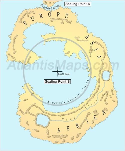
Figure 23 – Schöner’s scaling of an ancient map of the world onto his Globe of 1515. At the top, the first scaling point is the English Channel, which sits in place of a purported strait passing from the Atlantic to the Pacific. The second scaling point is the center of Agrippa’s circular commentary delineated by the concentric coastlines of Italy, Turkey and Mauritania, which he centers over the South Pole.
With only the British Channel matched up and positioned at the site of the purported new strait near the 40th parallel, Schöner was still left with some final determinations to make before affixing the map to his globe:
- How large would the landmass be drawn in proportion to his world globe, the size of a small island or scaled to the size of a continent? And
- How would the landmass be aligned? Should it hang off of the tip of South America angling toward the west, east or somewhere between?
Schöner could easily remedy both these issues, by determining a secondary point on his source map that matched up to a secondary point on his globe. He would then be able to stretch the source map between the two set points on his globe while maintaining the map’s proportion, thereby establishing both scale and alignment in one fell swoop. Unfortunately for Schöner the account of the voyage did not provide any details of the southern landmass beyond the strait.
Convinced that his source map met the sailors’ parameters, but lacking any further detail from their account, Schöner would have been left to rely on the source map to reveal a secondary point, but it would not reveal itself in the form of a normal geographical feature such as a strait, a peninsula or a bay. Instead Schöner would find himself captivated by the landmass’ unusual inner sea which maintained a circular shape with a series of outlying concentric shorelines. Not realizing that the source map’s coastlines were altered to fit a specialized cartographic design scheme, Schöner may have pondered a natural dynamic capable of fashioning the landmass’ interior.
Perhaps equipped with the slightest knowledge of the centripetal force generated by a spinning object and the tendency for objects to repel away from center, Schöner would find himself intrigued by the fact that the center of a great spinning orb—Earth—lie just a ways below the 40th parallel: the South Pole. (Figure 23) Hence the final resting spot for one of the last remaining copies of an ancient Roman world map with the map’s English Channel placed just below the 40th parallel of South America, where an alleged strait had been reported. Meanwhile the center of its concentrically designed Mediterranean Sea extends and aligns to the South Pole. With this configuration, Schöner may have posited that the continent’s interior was expanding outward away from the southern pole due to forces created by the spin of the earth.
And this completes our breakdown of the three-step process responsible for Schöner’s incorporation of an ancient map onto his 1515 globe:
- Referencing a collection of ancient unidentifiable maps for a possible previous charting of the recent discovery,
- Reconciling the new discovery to one of these ancient maps, and
-
Scaling the ancient design to match the new discovery.
Which brings us back to Schöner’s 1524 rendering of the continent, a depiction that truly resembles the Antarctic continent, and raises the question: Is there any evidence to suggest that Schöner maintained this same methodology in its design and if so is there anything to suggest that he referenced a genuine map of Antarctica?